

Creative Direction, UI/UX, Digital Identity
Role: Creative Director / Designer
Client: Maynard James Keenan
Industry: Music, Entertainment
Overview
I collaborated directly with Maynard James Keenan on the redesign of the A Perfect Circle official website, concepting a fully immersive underwater-inspired digital world. The visual direction centered around an octopus motif — a symbol from the band’s iconography — set within a deep-blue aquatic environment that felt both mysterious and cinematic.
The goal was to create a digital experience that reflected the band’s mood, mythology, and emotional range. The result was a website that felt like entering a submerged, surreal universe rather than browsing a standard band site.
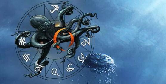
The core visual idea was “the ocean as consciousness.”
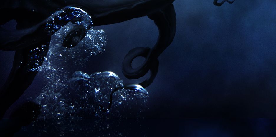
A drifting, tentacled octopus floating in an abyss — symbolic, intelligent, and otherworldly — became the anchor for the entire design system. Abstract currents, ink-like textures, and ethereal light gradients created a dreamlike, submerged atmosphere across the interface.
Key Creative Elements
- A fully illustrated octopus rendered as the central emblem
- Deep ocean textures, ink clouds, and glimmering particulate “stardust”
- Motion that suggested slow underwater drift
- Typography and UI that felt quiet, deliberate, and spacious
- Album and tour content emerging from the “depths” as layered content panels
The mood was meant to feel introspective, weightless, and slightly surreal — true to the band’s sonic and visual identity.
My Role
- Art direction & visual strategy
- UI/UX design
- Layout and interface development
- Integration of album and tour content into the thematic world
- Collaborating directly with Maynard on aesthetic decisions
- Unifying all pages into a single atmospheric design language
Challenge
The band’s earlier site was practical but lacked emotional resonance. It didn’t reflect the surrealism, symbolism, and moodiness that define A Perfect Circle. We needed a site that:
- Felt immersive without being overwhelming
- Gave fans instant access to music, tour info, and band history
- Strengthened visual identity through thematic worldbuilding
- Stayed true to the band while feeling modern and innovative
The underwater/octopus concept allowed us to create a branded digital world that deepened fan connection while keeping the UX clean and usable.
Approach
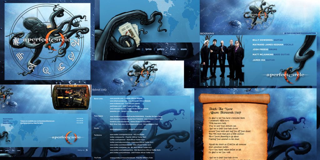
1. Building an Immersive Underwater World
Rather than a flat grid-style website, I designed a layered, floating environment. Album art, lyrics, and images appeared to rise from the depths, surrounded by the octopus emblem and drifting textures.
2. Iconic Octopus Motif
The illustrated octopus wasn’t just decoration — it served as a symbolic guide throughout the interface. Different tentacles subtly framed navigation, content modules, and transitions.
3. Cinematic UI/UX
Micro-animations mimicked slow underwater movement:
- Menus glided into place
- Particles drifted
- Images faded in like bioluminescence
The site felt alive, but never distracting.
4. Clear, Fan-Focused Structure
While atmospheric and artistic, the site still respected user flow:
- Music & albums
- Tour dates
- Merch
- Band info
- News updates
Every section lived inside the ocean world but remained intuitive and accessible.
Outcome
The redesign transformed A Perfect Circle’s digital presence into an evocative, living environment. Fans no longer just visited a website — they entered a world aligned with the band’s emotional landscape and imagery.
Results included:
- Stronger aesthetic alignment with the band’s identity
- A richer, more immersive fan experience
- A cohesive visual system adaptable for new releases
- A site that felt like an extension of the band’s mythology
This project remains one of my favorite collaborations — a rare opportunity to merge symbolic storytelling, UI design, and atmospheric worldbuilding alongside an artist whose vision is both sharp and deeply intentional.
Credits
Creative Direction & Design: Albertico Acosta
Programmer: Tim Maffet
Client: Maynard James Keenan